Playground
Playground is a remark plugin and React component that allows you to create rich and interactive code examples for your documentation or web application. In addition to providing basic code rendering and highlighting, Playground also includes several features that make it easier for users to understand and interact with the example code.
Installation
To use Playground, you first need to install it as a dependency in your project:
npm install remark-playground --save-devAs a React component
To use Playground as a React component, you need to import it into your project and use it in your code. Here's an example of how to use Playground in your React code:
The Playground component takes a single child, which is the code you want to display in the example. You can include any valid JSX code as the child.
Features
The Playground component provides several features that make it easier for users to understand and interact with the example code. Here are some of the key features:
Rule
The Playground component includes a rule that separates the example code from the rendered output.
Show code
The Playground component includes a button that allows the user to toggle the visibility of the example code.
Copy code
The Playground component includes a button that allows the user to copy the example code to their clipboard.
Mobile, table, and desktop options
The Playground component provides options for displaying the example code and output in different formats depending on the device size.
Error handling
The Playground component provides error handling for the example code, and displays any errors that occur during code execution.
By using the Playground component and its features, you can create engaging and interactive code examples for your documentation or web application.
Example
import Playground from 'remark-playground';

import Card '...'

# Card

The `Card` component is a simple styled div that can be used in your application.

<Playground>
  <div>
    <Card />
  </div>
</Playground>() => {const [state, setState] = React.useState(0);return (<div><Card /><button onClick={() => setState((state) => state + 1)}>up</button><h2>{state}</h2></div>);};
<div><Card /></div>;
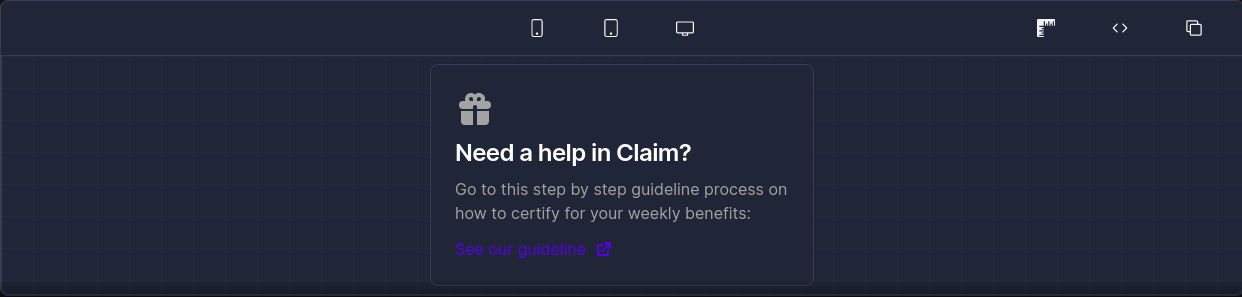
<div class="flex justify-center"><div class="max-w-sm p-6 bg-white border border-gray-200 rounded-lg shadow dark:bg-gray-800 dark:border-gray-700"><svgclass="w-10 h-10 mb-2 text-gray-500 dark:text-gray-400"aria-hidden="true"fill="currentColor"viewBox="0 0 20 20"xmlns="http://www.w3.org/2000/svg"><pathfill-rule="evenodd"d="M5 5a3 3 0 015-2.236A3 3 0 0114.83 6H16a2 2 0 110 4h-5V9a1 1 0 10-2 0v1H4a2 2 0 110-4h1.17C5.06 5.687 5 5.35 5 5zm4 1V5a1 1 0 10-1 1h1zm3 0a1 1 0 10-1-1v1h1z"clip-rule="evenodd"/><path d="M9 11H3v5a2 2 0 002 2h4v-7zM11 18h4a2 2 0 002-2v-5h-6v7z" /></svg><a href="#"><h5 class="mb-2 text-2xl font-semibold tracking-tight text-gray-900 dark:text-white">{" "}Need a help in Claim?</h5></a><p class="mb-3 font-normal text-gray-500 dark:text-gray-400">{" "}Go to this step by step guideline process on how to certify for yourweekly benefits:</p><a href="#" class="inline-flex items-center text-blue-600 hover:underline">{" "}See our guideline<svgclass="w-5 h-5 ml-2"fill="currentColor"viewBox="0 0 20 20"xmlns="http://www.w3.org/2000/svg"><path d="M11 3a1 1 0 100 2h2.586l-6.293 6.293a1 1 0 101.414 1.414L15 6.414V9a1 1 0 102 0V4a1 1 0 00-1-1h-5z" /><path d="M5 5a2 2 0 00-2 2v8a2 2 0 002 2h8a2 2 0 002-2v-3a1 1 0 10-2 0v3H5V7h3a1 1 0 000-2H5z" /></svg></a></div></div>;